A robust data storytelling toolkit
From DataCoach™ to DataCheck,™ and a Quick Access Toolbar, participants leave with hands-on tools they can plug into their daily workflows immediately.
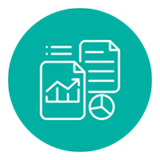
The Data Visualization Library
A suite of 100+ professionally designed data visualizations that guides teams through the five ways to display data and provides inspiration, pro-tips, and coaching examples to help make presenting data quick and simple.
Coaching that goes beyond the classroom
Guidance and feedback embedded directly into the tools supports learners as they execute on their data strategy, during the workshop and beyond.
Training that doubles as productivity
Participants bring real data-rich presentations to transform during the workshop. It’s not time away from work; it’s time spent on it.
Data storytelling credentials
Upon completion of this data visualization course, participants earn a digital badge to showcase their achievement and share it with their professional network.